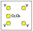
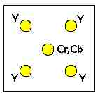
I'm currently editing my holiday video and, for the first time, wished to use a blue screen matte for a sequence. Having heard all sorts of dire comments about blue screen (as opposed to green) on DV footage, I was rather surprised to find that it came out perfectly, not the slightest trace of jaggies, bleeding, overlapping, fringing or whatever, even when examined very critically, frame by frame, full screen. I'm so "déçu en bien" that I'm inclined to ask what went wrong. Now, those who complain, I think, are possibly all from the NTSC side of the pond with a 4.1.1 colour depth. Is the fact that the PAL 4.2.0 depth, the larger number of vertical pixels or the colour phase alternation likely to influence the blue screen results in a positive direction? Or am I missing something with this fluke?
Just to make sure that you have all the cards on the table, the image with the blue screen background is a still of a sitting Buddha reduced to 720 x 576 and everything except the Buddha is carefully blued. This has a moving path applied so that the Buddha appears to be zoomed in from about 40% size (280 pixels) to 100% size. This is on V3. To avoid the framing at <100%, I also put a blue dummy frame, also chroma-keyed out, on V2. I applied similarity of 30% (there was nothing blue in the shot, whereas the Buddha was green jade, which was why I didn't use green) to avoid any blue spots in the background (I guess my painting wasn't quite perfect). The background (video shot) was of the temple containing said Buddha (which I wasn't allowed to video but could surreptitiously photograph). The end result is exactly what I wanted.
Just to make sure that you have all the cards on the table, the image with the blue screen background is a still of a sitting Buddha reduced to 720 x 576 and everything except the Buddha is carefully blued. This has a moving path applied so that the Buddha appears to be zoomed in from about 40% size (280 pixels) to 100% size. This is on V3. To avoid the framing at <100%, I also put a blue dummy frame, also chroma-keyed out, on V2. I applied similarity of 30% (there was nothing blue in the shot, whereas the Buddha was green jade, which was why I didn't use green) to avoid any blue spots in the background (I guess my painting wasn't quite perfect). The background (video shot) was of the temple containing said Buddha (which I wasn't allowed to video but could surreptitiously photograph). The end result is exactly what I wanted.


Comment