Announcement
Collapse
No announcement yet.
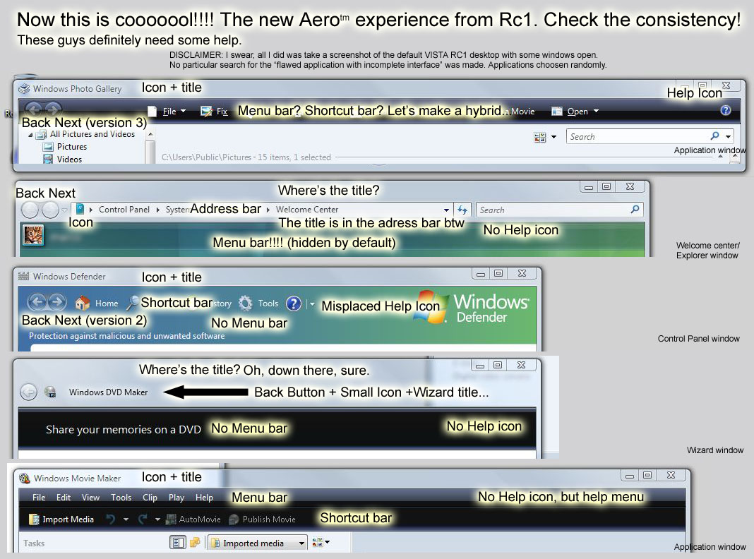
Vista UI mode comparison
Collapse
X
-
Looks like Amiga WorkBench but WB will happily run on 32 MB & a 24 mhz CPU
 Last edited by Dr Mordrid; 21 September 2006, 16:48.Dr. Mordrid
----------------------------
An elephant is a mouse built to government specifications.
I carry a gun because I can't throw a rock 1,250 fps
Comment
-
I'm just a little perplexed by some of the UI differences between the levels that don't necessarily affect the rendering speed or hardware requirements. The color changes in the styles are a bit odd as well, but I guess maybe that is an extra visual indication that your hardware sucks or not.“And, remember: there's no 'I' in 'irony'†~ Merlin Mann
Comment
-
BTW Doc, you might be interested in progress Aros made in the last few years
I think it's the best chance Amiga has at surviving somehow into the future...OS is mostly complete, but of course it's not much point to use it due to lack of apps; however, KHTML engine (Konqueror, Safari) will be available for sure in some time, so at least one will be able to browse the web
There's also LiveCD ditro, that can be run under Windows using Qemu (yep, machine/cpu emulator, not virtualisation...but it's still blazingly fast)
edit: you probably also would have some fun with Amithlon - it allows running classic AmigaOS on x86 computer that appears almost native (translating 68k to x86 on the fly). Too bad it's somehow impossible to get now...but look at benchmarks (I suppose you've had A3000 or 4000 for video editing?)

Last edited by Nowhere; 21 September 2006, 18:06.
Comment
-
Know about AROSOriginally posted by NowhereBTW Doc, you might be interested in progress Aros made in the last few years
I just picked that pic because it had a clock in the right position. In fact I have two Amigas still running in the studio, both with Video Toasters: A3000 & A4000 towers.Dr. Mordrid
----------------------------
An elephant is a mouse built to government specifications.
I carry a gun because I can't throw a rock 1,250 fps
Comment
-
Well, technically speaking Apple never ditched menubars, they simply placed it at the top of the screen, in a global location for all applications. MS is ditching the entire concept of separate menu and toolbars.
To be fair to MS, the differences in UI for the different apps isn't something new, as Apple has been doing it for some time (there are at least five different UI styles from them). To a degree, it's a fairly good idea if the styles are relegated to applications with certain functions. Example being the brushed metal style from Apple was supposed to be limited to apps that imitated real-world items or were media-centric (obviously they didn't limit it to those, neither did 3rd party developers).
MS seems to be happy to follow that lead though, with UI styles that look similar but are just different enough to make things less than cohesive.“And, remember: there's no 'I' in 'irony'†~ Merlin Mann
Comment
-
Yes, I'm aware about menus in OS X...but in the past apps on MacOS relied almost exclusivelly on the menus...but now there isn't so much need to use them. And one question about different style in OS X (I don't have enough exposure to it) - aren't the layouts of the apps mostly the same (more than in above example), even if looks are different?
That said, I think it's a generally good direction - aren't menus mostly a quick & simple "hack" that transformed commands of commandline into GUI?
Comment
-
The GUI design guidelines of OS X (and previous Mac OS versions with toolbars) basically state that the primary interactions with an application should occur via the toolbar, hence the lessened importance of the menubar. Mac apps also rely heavily on keyboard shortcuts for common functions. So yes, there is less of a need to use the menubar.
As far as layout goes... in general, yes the layouts between various apps are consistent; however, layouts in Mac applications have largely been dictated by function. I wouldn't say that those screens of windows under Vista are any more inconsistent than many in OS X, except that those in Vista are inconsistent in so many ways (layout, style, colouring, etc.).
You're right though, menus came into existence when applications moved from the commandline to GUIs. As apps became more complex, more menus were added. Toolbars attempted to alleviate this by placing the most frequently used commands in plain view, but as well all know, this didn't work so well when toolbars themselves began to become overly crowded. Windows-based apps have always been worse about that than Mac OS-based apps, but that's more a result of the latter falling into the "simple apps that do one thing well" category (with some notable exceptions).
On Mac OS there is little need to ditch the menubar, but in Windows I can see nothing but good things coming from removing the separation between menubars and toolbars. MS Office solves this one way with the Ribbon, the Windows UI with a hybrid bar (which has actually been possible since Windows 98).
I think this is all a result of people wanting simpler applications in the regard that commands don't appear until they're needed (which used to mean disabling them in a menu, given that randomly appearing menus is a bad thing), or rather, relevant to the operation being performed.“And, remember: there's no 'I' in 'irony'†~ Merlin Mann
Comment


Comment